
Today I downloaded a copy of the “DNC After Action Report”, an “autopsy” written for the Democratic National Committee by strategist Paul Rivera to attempt to explain Kamala Harris’ loss of the 2024 United States presidential election. In response to news reports confirming the autopsy’s existence, DNC chair Ken Martin released a copy of the unfinished report, annotated with giant red boxes explaining all the parts he(?)1 disagrees with and generally rebuking the quality of Rivera’s work. I will not be commenting on the quality of this report or lack thereof, because there is a much more striking issue for me to comment on: the entire report (sans giant-red-boxes) is inexplicably typeset in Calibri.
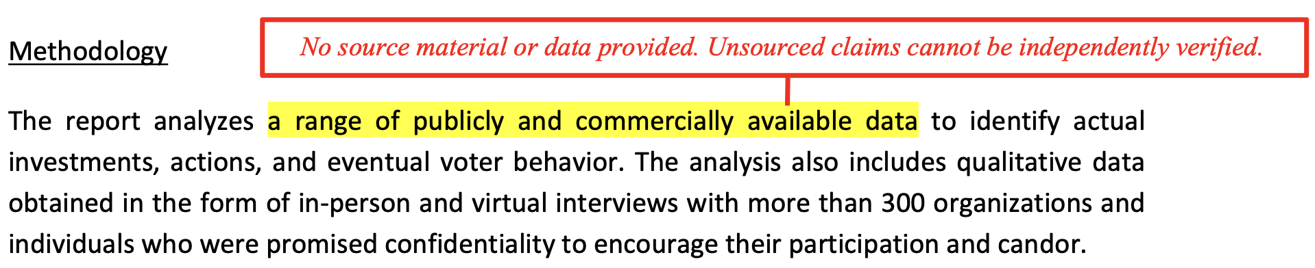
There is no comment from DNC leadership mentioning this despite it being the most glaring issue present in the whole affair, but the comments themselves (by virtue of being typeset in Times New Roman) make the absurdity of the report’s font choice obvious. The interplay between the report’s assertions and the comments’ retorts gives the responses a “parent scolding their child” quality, one that makes me question if the use of Calibri to present the report is a deliberate act of sabotage on the part of whoever wrote the comments. Strongly contrasting the official report is the document you get if you click on “Autopsy: How Democrats Lost the White House”, one of the first search results2 to unsuspecting people Googling for the DNC autopsy; but that website actually hosts a completely different “autopsy” produced without the DNC’s involvement by advocacy group “RootsAction”. Their autopsy is set in Times New Roman, making it look far more official and authoritative than the real thing. The favorable SEO enjoyed by the site hosting this unofficial autopsy, and the unofficial document’s superior presentation, likely confused many people as to which document was the one referenced by the current media cycle. It is for this reason that font choice is so important, and therefore that the default font for general-purpose publishing software must be one sensible in any context: poor choice of typography is garish at best and cedes control of a narrative at worst.3 To explain the inappropriateness of Calibri in this context I will defer to a contrast between Times New Roman and a vastly more well-understood font, Helvetica.

Helvetica is design. Times New Roman is the absence of design. That is not to say Times was not designed with lots of thought and care or that its creators were not smarter people than me, but rather that its use never consciously registers as a choice, a unique property few other fonts have. Using Helvetica is undeniably a choice—it conjures echoes of high modernism, it seems to make a statement that every sharp corner can be sanded away, that all life’s ills and society’s problems can be obliterated by smart application of technology and aesthetics. It is the typographic equivalent of Eno’s Music for Airports, self-described “music to resign you to the possibility of death”. Helvetica convinces you that everything will be okay, this train will be on time, this Space Shuttle will lift off, this Company’s financials are sound, this tax form will be correctly processed. This quality renders fonts in Helvetica’s class wholly inappropriate for explaining how a thing went wrong; an NTSB Accident Report set in Helvetica would require its own NTSB Accident Report. Apple’s choice of Helvetica Neue as the default font for their Pages word processor is instructive: they do not care about their software’s fitness for writing legal briefs, formal complaints to landlords, or political strategy postmortems; they want you to use Pages to create beautiful documents, flyers for your alternative band, community newsletters, indie zines, and posters taped to utility poles.4 Helvetica is a font for pretty and safe and reassuring things like transit signs informing you which side of the platform to board on. It would be a wholly inappropriate choice for the default font of a word processor like Microsoft Word, used by Professionals to do Serious Business. But it is certainly a good font. Plenty of decent fonts are unfairly maligned simply for their misuse. Comic Sans MS would not be hated if it had actually only been used to render dialog boxes in Microsoft 3D Movie Maker. Helvetica, likewise, is a fantastic font when used in the right context. But it is always striking and immediately noticeable. There’s a reason it only lasted one year as macOS’ system font.

Times New Roman, by contrast, is background entropy. It is visual tinnitus. Its use, when noticed, is immediately disregarded by all humans except web designers.5 This may sound negative but is a potentially good thing, because it renders Times one of the only typefaces suitable for literally any purpose. In practice this is a good thing because the font was designed for the eponymous newspaper, and newspapers need to publish everything in a uniform typeface (from frivolous entertainment and celebrity news to investigative reports on war crimes). The practical versatility of Times New Roman is in large part due not to any specific features of the font’s design but the aforementioned desensitization to it we all experience as a result of it being treated as the default in so many contexts, both in print and computing. (When was the last time you read a book typeset in any other font Windows ships with?) Anecdotally, reading text set in Times has almost no effect on which funny accent my internal monologue takes on upon parsing the words.
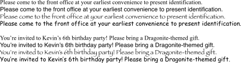
Matthew Butterick admonishes writers to never use Times New Roman because it is “favored only by the apathetic and sloppy”. This is true but is not a reason to avoid using Times. The reason Times looks apathetic is because it is the default. But the only reason it is capable of expressing such a varied range of sentiments is this apathy. And it must remain the default for it to continue being perceived as such. To choose to make the default font something other than Times New Roman is to take power away from Times New Roman, power that is in many cases necessary. Sometimes you want your writing to look apathetic. Apathetic is better than gaudy. Apathy is appropriate for communications from a government agency, for political parties’ internal memos and reports about why they lost the election. Apathy and corporate is the perfect pairing.
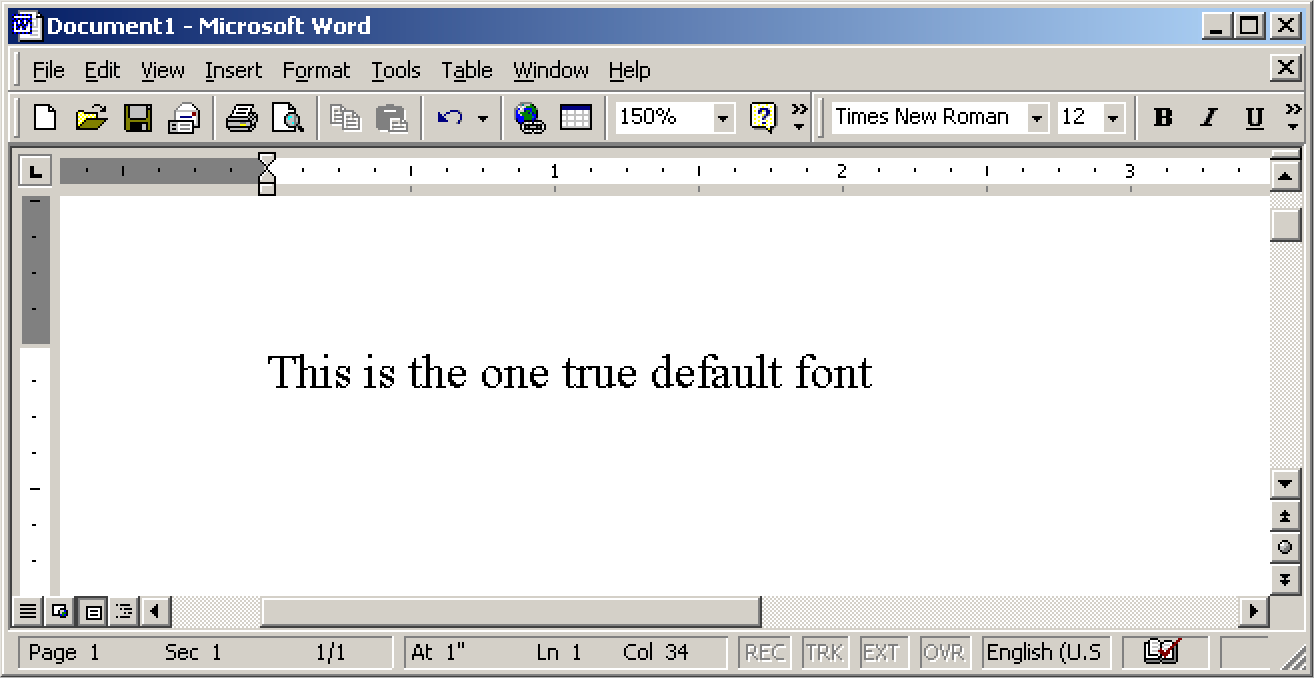
More importantly, if you actually are apathetic, your document being typeset in a different default font is not going to make you look any less apathetic. When you see a document typeset in Calibri (which was the default font for Microsoft Word from 2007 to 2024) or Aptos (the new default font used by Word since 2024), it looks equally apathetic because not only do you know they’re using the default font but you know what specific program’s default font they’re using to write the document. When you see a document in Times New Roman you do not learn any new information about the author of the document, because you don’t even perceive the font; but even if you did, because it’s a universally available font on practically every computing platform you cannot infer anything about the software the author is using. When you see a document typeset in Aptos, not only do you know that the author is apathetic, you also know that there is probably a Copilot button in their ribbon bar right now. This is actively far more embarrassing for the author than if they had deliberately chosen to use Times.
Calibri and Aptos, like Helvetica, are fonts with design, with a clear message. This message is kind of ruined by them being saddled with the baggage of “embarrassing default Word font”. And yet embarrassing default fonts they are, because for some reason all major word-processing software vendors have decided to default to streamlined, opinionated sans-serif typefaces; Microsoft with Calibri and Aptos, Apple with Helvetica Neue, Google with Arial. We live in a hellish world where no tech company wants to save lazy writers from themselves and thus when I look at the flyer advertising your event I learn more than I care to about how much taste you have not only in typography but in software. Only LibreOffice is here to save the apathetic by defaulting to Liberation Serif (a free metric-compatible clone of Times New Roman), but unfortunately this has zero impact on the world because the apathetic do not download and install open-source software.
How many hours has society collectively wasted clicking the font drop-down to switch to Times New Roman on every new document creation because the average user does not know how to set the default font? It’s not too late for us to fix this. Easy-to-read sans-serif humanist typefaces are great, but they only carry meaning if they were chosen deliberately—to communicate an idea, a vibe, a message. Times New Roman, by contrast, never carries any meaning and communicates nothing. It is the most neutral choice there is. To let it remain so, it should return to its prestige as default font in any writing context, so that we may spare political consultants from further embarrassment.